

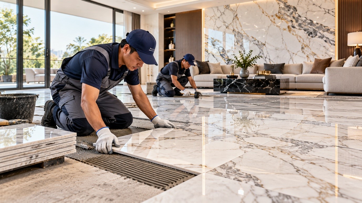
An expressive material can bring depth to a compact interior when its scale, placement and surroundings are carefully considered.
A small room does not have much space for competing ideas. Every surface sits close to another, and a detail that would remain secondary in a large interior can become unavoidable in a compact one. This makes stone an interesting design choice: it can introduce a strong character through a relatively limited area.
The challenge is to decide how much attention that character should receive. Covering more surfaces is not automatically a stronger statement. A carefully placed tabletop, panel or ledge may do enough. The designer’s task is to understand the room as a whole and edit the material into it.
Begin with what the room already says
Before choosing a slab, look at the features that already organise the space. A window might provide the main focus. A timber floor may carry a strong rhythm. A collection of books or artwork may be central to the owner’s life. The proposed stone should have a relationship with those elements.
Consider a hypothetical city apartment where the living area also serves as a dining room. There may be no need for a new feature wall if the dining table already occupies the visual centre. Giving that table an expressive surface can concentrate the material where it will be seen and used.
This approach begins with a role, not a product. The stone might anchor the seating area, provide a quieter background to a collection, or mark the transition from entrance to living space. Once that role is clear, the search for colour and pattern becomes more disciplined.
Read a catalogue as a starting point
When reviewing a Thai stone catalogue, the label หินอ่อน identifies marble, but it does not describe one uniform visual effect. The category can be the beginning of a conversation about colour, movement and finish. It should lead to a shortlist suited to the room rather than settle the decision on its own.
An online image is useful for comparison, particularly when a client and designer are discussing possibilities from different locations. It is less useful as a final promise about the exact piece that will be supplied. Ask what the image represents and arrange to review the proposed material before approving it.
Looking at a broad catalogue can also clarify what attracted the owner in the first place. Was it a pale background, a strong vein, a warm colour or a sense of irregularity? Naming that quality helps the team compare alternatives without getting trapped by the first photograph that caught their attention.
Let the pattern meet the scale
The relationship between pattern and dimensions deserves its own drawing. A dramatic movement may feel coherent across a large panel but read very differently when divided among several small pieces. The point is not to avoid expressive stone in a compact room. It is to understand which part of the pattern the room will receive.
Ask the fabricator to show the proposed arrangement within the selected material. A sketch or marked image can help the owner see where a prominent vein will sit and what will happen at the edges. That discussion should occur before the visual composition is treated as settled.
Furniture and fittings belong in the same review. If a lamp, shelf or television will cover the most expressive part of a panel, the design may be paying for an effect that remains largely hidden. Moving the feature, reducing its extent or selecting a calmer piece can all be reasonable responses.
Use light as part of the review
A material should be considered in the room’s actual lighting conditions wherever possible. Place samples near the intended location and look at them at different times of day, then under the proposed evening lighting. The goal is to judge whether the combination feels right in the setting where it will be lived with.
View the stone beside the wall colour and other major finishes. A sample considered on its own can encourage decisions that are difficult to reconcile later. A simple grouping of materials gives everyone a shared reference and exposes disagreements while changes remain manageable.
Take photographs to document the discussion, while recognising that the images are references rather than exact reproductions. Record which sample and finish were approved. The final decision should be grounded in the material itself and a clear understanding of how it will be used.
Restraint can protect everyday comfort
A compact interior has little room for details that interfere with movement or use. The dimensions of a table, the position of an edge and the relationship between furniture pieces matter at least as much as the surface pattern. An attractive finish should support those practical decisions.
Imagine a narrow entrance where a deep console would crowd the route into the home. The answer might be a shallower piece with a carefully chosen stone top, or no console at all. The design can preserve the desired material character without insisting on a furniture type that does not fit.
The same discipline applies to the budget. Concentrating stone in one meaningful location may allow closer attention to the actual piece and its finishing. Expanding it across the room simply to achieve continuity can dilute the idea if other essential details have to be compromised.
End with a composition, not a collection
The room should eventually be judged with its ordinary contents in place: cushions, books, tableware and the objects the owner wants to keep. Stone is one part of that composition. It should not require the rest of a person’s life to disappear so that the design can make sense.
A small interior can carry a confident material choice. What it needs is a clear reason for that choice and the discipline to stop when the room has enough. The most persuasive use of stone may be the one that feels inevitable once it is there, even though it occupies only a small part of the space.